experience-design
Successful Single-Page Checkout

With a 69% shopping cart abandonment rate online, it’s no wonder more and more Product Owners are asking teams to consider a single-page guest checkout design.
Not only is a single-page checkout experience potentially easier and quicker to implement, but it can be a great way to increase conversion rates when executed effectively.
A popular “one page” solution consists of a user-friendly cart that’s clear and straightforward. The goal is to eliminate anything extraneous and trim the checkout flow down to only the forms and fields critical to the customer’s purchase journey.
While a short, simple checkout sounds delightful in theory, several challenges accompany this style of design. Whether you are building a brand new experience or updating a current site experience, here are some essential steps to implementing a successful single-page checkout.
Create Concise Forms
Since every element of checkout lives on one page, it is easy to end up with an overwhelming volume of content to enter. Fight temptation to flood the screen with lengthy forms and fields for the customer to fill in. The user has already made their intention clear. They are ready to buy, so it’s the product and design team’s job to optimize your checkout process to be as quick and painless as possible.
Only ask for the most basic and most essential details from your customers. These details usually include email address, billing address, shipping method, and payment option, to name a few. Be sure to include helpful tips, field prompts and micro copy around buttons and fields to save customers even more time. If a user has already entered a billing address, allow them to use the information for their shipping address instead of asking them to re-enter it.
Pre-populate fields whenever possible. This helps minimize the length of forms while also significantly reducing user effort. One of the easiest ways to guide customers through pre-population is by moving the country or zip code fields higher on the screen. Then use the entered data to populate fields like city, state, the 9-digit ZIP code, and even shipping cost.
Be sure to place an asterisk beside all mandatory form fields, especially if you have only a few optional fields on a form. For an even simpler experience, consider removing the optional fields so the asterisk marker is unnecessary. Simply say that all fields are required.
When asking for additional info outside of the basics, be sure to indicate why you’re requesting it with a tooltip or similar callout. Although some customers may be suspicious additional content is requested, like for example a secondary contact method, the customers’ worries are often eased when the site clearly explains the reasons behind the request, i.e., to coordinate shipping-related questions.
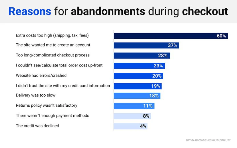
Avoid asking customers to create an account. According to a 2017 Baymary study, 37% of customers cite account creation as their reason for cart abandonment. Allow customers to check out as guests, to sign in with existing accounts, or even to use other credentials (i.e Apple ID, Facebook, PayPal) to connect their information.
Include a Functional Back Button
The ‘Back’ button is one of the most-used buttons in general web browsing, so it is no surprise a majority of eCommerce customers rely on this simple tool to do things like modify their cart contents.
Aside from allowing customers to navigate back to previous screens, be sure to capture any information they may have entered on the checkout page. Having to re-enter contact and other information can be cumbersome and may lead users to abandon the process altogether.
Customers are always relieved to know they can modify an orders throughout the checkout process. This practice improves a site’s user experience and generally lead to more conversions overall.
Leverage Staged or Nested Checkout
Staged and nested checkout essentially provide you with the best of both worlds. These function similarly to multi-page experiences, but are packaged to house an entire checkout process on just one page.
Staged designs require users to fill out several specific forms before clicking ‘Continue,’ while nested designs naturally expand various sections of the page as users moves through the checkout process.
Track Customer Progress
While a single-page checkout allows customers to complete the entire process in just one step, it is still important to relay the user’s progress in completing each task on the checkout page.
Displaying a customer’s progress during checkout indicates how far along they are in the process and, in turn, how close they are to the end goal. Not only does this provide a clear explanation of the task at hand, but it increases satisfaction and engagement.
The simplest way to track customer progress is by indicating the goals in the checkout process that still need to be completed.
A process indicator should show what’s to come and the tasks already completed. This gives the user a full picture of the process allowing them to easily track how many steps they have left to complete before finalizing their purchase.
Tell the User What to Expect
While the progress indicator tells users what to expect during the checkout process, it’s critical to continue to keep them in the loop once after they have completed checkout.
Once customers finalize an order, follow up with a Thank You message that conveys your appreciation and sets expectations for fulfillment. Set clear expectations for your customers by explaining next steps, such as an order confirmation email, shipment notification and how to handle changes etc. This is the perfect opportunity to clarify any uncertainties your customer may have about their new purchase.
Provide Real-time Support
Tech savvy and novice online shoppers alike can run into trouble or confusion during checkout. Real-time shopper support serves to resolve these issues and alleviate any doubts customers may have regarding their purchase or the checkout experience itself.
While FAQ pages may serve to answer many checkout-related inquiries, many users prefer live support when they have a question or concern. If possible, offer customers more than one way to get in touch, like email, live chat, and even a customer support phone number.
Live support saves customers the time of navigating to another page on your site and provides a better opportunity to have their question answered promptly, avoiding endless searches, and scanning through a laundry-list of common problems.
Conclusion
As you begin designing or modifying your single-page checkout experience, be sure to keep these best practices in mind. The key to a successful checkout is clarity, ease, good communication and practical customer support.
If you’re looking to transform an eCommerce experience through innovative design and best-in-class technology, reach out to Object Edge to learn more about our Experience Design services.
Related articles
-

experience-design
How Customer Journey Mapping Boosts ROI
Journey mapping is an exercise in truth-telling. It determines where people drop off the path to purchase, and more importantly, why.
-

experience-design
5 Ways to Optimize Content Discovery
5 ways to optimize content discovery for memorable experiences that intuitively move your audience to your content, leading to more online transactions.
-

experience-design
Writing a User Story to Build an eCommerce Store
Learn how to develop user stories, which can help guide the development of your user experience, product management, web design, and more.