Data visualization is a powerful tool that allows businesses to gain insights from complex data sets, and present them in an easily understandable format that provides a comprehensive view of key performance indicators (KPIs).
Data visualization is a powerful tool that allows businesses to gain insights from complex data sets, and present them in an easily understandable format. A data visualization dashboard is a tool that provides a comprehensive view of key performance indicators (KPIs) and metrics, and allows users to interact with the data.
5 Best Practices for Creating a Data Visualization Dashboard
A good data visualization dashboard allows users to quickly and easily see and synthesize complex information. Best practices include:
Understand your audience: understand who will be using the dashboard and their needs so you can design a dashboard that is relevant and useful.
Keep it simple: A data visualization dashboard should be easy to use and understand. Avoid cluttering the dashboard with unnecessary information and focus on presenting the most important data.
Use the right visualizations: Different types of data require different types of visualizations. Use the appropriate visualization for the data you are presenting.
Ensure accuracy: The data presented on the dashboard should be accurate and up-to-date. Errors or discrepancies can lead to incorrect conclusions.
Provide context: Provide context for the data being presented to help users understand the significance of the data.
Benefits of Data Visualization
Data visualization offers several benefits to businesses. These include:
Improved decision-making: Data visualization makes it easier to identify trends and patterns in data, which can help businesses make informed decisions.
Better communication: Data visualization makes it easier to communicate complex data to stakeholders, making it easier to get buy-in for projects.
Increased efficiency: Data visualization can help businesses identify areas of inefficiency and improve processes.
Improved data quality: Data visualization can help businesses identify errors and discrepancies in data, leading to improved data quality.
The Future of Data Visualization
A forward-looking article from McKinsey paints a picture of the future of data, analytics, and visualization. In this 2022 article, they imagine a 2025 in which: “Nearly all employees naturally and regularly leverage data to support their work. Rather than defaulting to solving problems by developing lengthy—sometimes multiyear—road maps, they’re empowered to ask how innovative data techniques could resolve challenges in hours, days or weeks… Vast networks of connected devices gather and transmit data and insights, often in real time. How data is generated, processed, analyzed, and visualized for end users is dramatically transformed…. Altogether, this enables many more advanced use cases for delivering insights to customers, employees, and partners.”
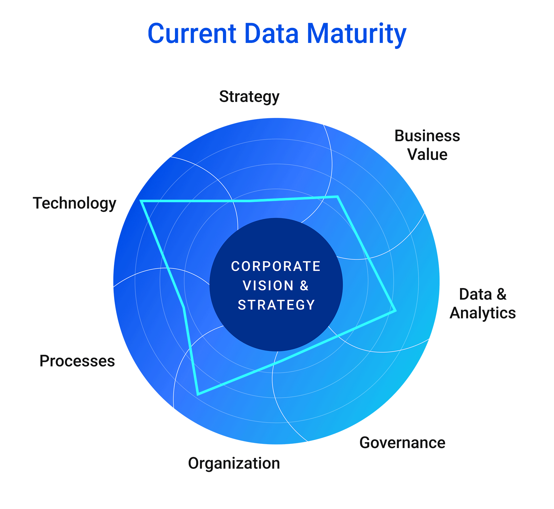
Data Maturity Assessment
Get a complimentary assessment of your data maturity - from strategy through technology - with a roadmap to success. Schedule your complimentary maturity assessment.
So what stops organizations from visualizing their data well? A few challenges to this include:
Data quality: Data quality is critical to the success of a data visualization dashboard. If the data is inaccurate or incomplete, the insights generated from the dashboard will be flawed. (Read more in our article about Data Decay.)
Data overload: Data overload can lead to a cluttered dashboard that is difficult to use and understand.
Lack of context: Data without context can be difficult to interpret. Providing context is essential to ensuring that the data presented is meaningful.
Technical challenges: Creating a data visualization dashboard can be technically challenging. It requires expertise in data analysis, data visualization, and dashboard design.
Data Visualization Consulting Services
Data visualization consulting services provide businesses with the expertise needed to create effective data visualization dashboards. At Object Ege, we help complex businesses identify the most important KPIs, choose the appropriate visualizations, and design a dashboard that is easy to use and understand. Contact us to talk with a data expert.
About the Author
Vinny Maurici
VP of Data Engineering
As Vice President of Data Engineering, Vinny is accountable for the growth, success and thought leadership of the Data Management business at Object Edge. He brings 15+ years of master data, merchandising, and governance experience; and has launched several successful enterprise and Fortune 500 global product data programs in B2B Manufacturing and Distribution, Retail, and Food Services.